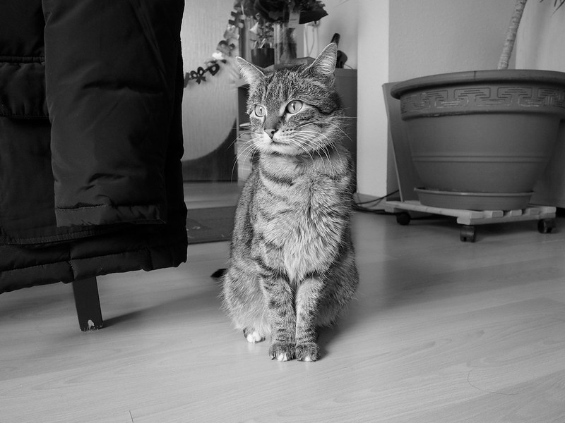
Zuleikha, with old and new lenses

When I got up this morning, Zuleikha and Mitchie were making an apple cake. And I started documenting the procedure with the 14mm lens on my E-PL5 and the 25mm lens on my E-M10 cameras.

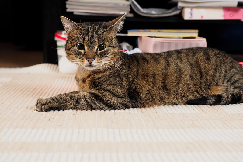
Later I told them that I could have taken most of the photos with the Olympus 12-40mm zoom lens (for about 1k€), and some even with the “kit” lenses we have, because I used apertures like f/5.6 with that 14mm lens. But this one wouldn’t have been possible with any other lens, since I’ve used my 25mm wide open at f/1.4:

7e0_2273530-waiting-for-the-cake

Waiting for the cake

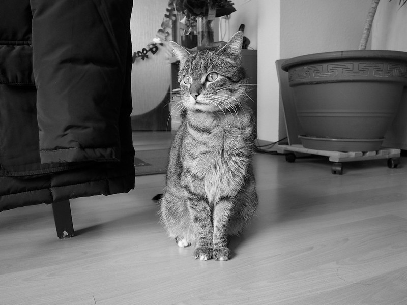
Later I read about old lenses on new cameras, and thought about what I have, like the OM G.Zuiko 50mm/1.4 manual focus lens from my OM-2N film camera. And since I was trying to get some kind of film look lately, I decided to try it again on my digital camera (we still have some film, but that’s not fast enough for low light):

7e0_2273535bwo-zuleikha

Zuleikha

I cropped that image to a square format, which in my opinion added to some kind of film impression (medium format was also very popular during that time, and many of these produced square negatives).

That image is certainly softer than the one from the modern lens, which was to be expected. But soft isn’t too bad for portraits; I remember one of Yousuf Karsh‘s (famous) clients asking him to have mercy on her. So for portraitists, a lens like this wouldn’t be a bad choice at all – you save lots of (artificial) brush strokes in post processing if you’re more merciful from the get-go. Not that our 11-year-old girl would need it, but for adults this could be an advantage… 😉

Technical info about the last one: this was with the lens on aperture f/4, and with 1/8th of a second at ISO 1600. The main light was a halogen flood light against the ceiling but across the room, full power at 250W. And to Zuleikha’s right (picture left), you have our 5 Watt LED reading light. Camera on tripod, of course manually focused. Added a bit contrast with the Olympus Viewer 3 using an S-curve (Highlights +2, Shadows -3), and blacks, Exif and ITPC data with RawTherapee.

Oh, and the apple cake is delicious. We’ll have the rest of it tomorrow.

Thanks for reading.
Other (but “classic”) formats

It’s no secret to readers of this site that we use Olympus (plus one Panasonic) cameras from the beginning of our digital time. And small cameras as well as mobile phones and (Micro) Four Thirds cameras use an aspect ratio of 4:3, while your typical DSLR uses a wider 3:2 format which dates back to Oskar Barnack and his invention, the Leica camera.

Recently I was thinking of him when looking at my Panasonic Leica lens which is on one of my cameras most of the time. I’m taking lots of black & white photos with that lens, and I thought why I didn’t also use the format he invented? In horizontal (“landscape”) orientation I like it quite a lot, while in verticals (“portrait”) I prefer 4:3 or even something a bit more square, like 5:4 (remember those old plate cameras? That’s what they used, mostly).

So I’ve set one of my cameras to the 3:2 aspect ratio, and kept it like that. Here are some photos taken with the format:

7e0_2143405-tuna

7e0_2163420bw-arno

7e0_2183424bw-wolfgang

7e0_2218116bw-got-grip

7e0_2223489bw-anthurium

The picture of me was taken by Zuleikha (danke Schätzchen!), the photo of my camera was taken with my other one, and for the last picture I used my 40-150mm Zuiko Digital lens fully zoomed out. That somewhat longer lens handles a lot better with my camera now that I have a grip for it.

As always, if you want the photos bigger, click on them to go to Flickr where you can download them in full resolution.

Thanks for reading and/or viewing.

Got a grip

One of my birthday presents this year – and one I didn’t expect, so I was surprised about it – was an ECG-1 camera grip for my Olympus OM-D E-M10 camera. This is how it looks, photographed with my E-PL5 at 17mm (and you see part of Mitchie’s E-PL5 with her VF-4 viewfinder in the background):

7e0_2218116bw-got-grip

Got a grip

I had removed that from my wish list since a while, but now I’m glad that I have it (as long as you still get these, I think the newer E-M10 Mk2 has a slightly different one).

Thanks for viewing.

50mm vs. 35mm

An old discussion, I know, but I just (re-) found some good articles and a HCB interview, so here they are:

1. Why Henri Cartier-Bresson used a 50mm lens.
2. Why I switched from 50mm to 35mm as a primary lens for street photography.
3. HCB interview in the NYT (part 1 and part 2)

Enjoy reading.

Oh, and if you have zoom lenses only, or never used your fixed lens much, do it: set your zoom to 50mm (equivalent if it’s a “crop” camera with an APS-C or (µ)43rds sensor), or to 35mm (equivalent), and keep it there. Mike Johnston says “for a year”, but if you take your camera with you often enough and take lots of photos, then maybe you’ll learn a bit faster.

I do. I mean I’m still learning. At 59…

Two more photos from this weekend

Here are two additional photos I took, both using flash:

7e0_2133395-birthday-flowers

Birthday flowers, 8 days later…

7e0_2143405-tuna

Tuna the cat, February 2016

Technical info:

For the first photo I mounted my Yongnuo compact flash at the position and into the direction which normally our 5W LED reading light has. The flash had its included diffuser cap mounted, and the power setting was 1/4. On the camera and under the flash I used the Yongnuo CTR-301P trigger, and the lens was my 45mm at f/2.5.

For the cat portrait I used the same compact flash with the same setting and remote on my computer desk. This time the cap was not mounted, and the flash pointed indirectly to the walls above my monitor, camera right. On camera left, one of my studio strobes did the same at 1/8 power, optically triggered by the smaller compact flash. Here the lens was my 25mm at f/2.8. I cropped the picture into the 3:2 format after adjusting the tilt a bit (about 0.3 degrees to the right).

Thanks for viewing.

Three different – but “canned” – black & white conversions

Here’s a photo from Tuna from this morning. First one with “monotone” conversion, like Olympus calls it, by the Olympus Viewer 3 software – which does the same like when you set the camera to black & white directly:

7e0_2133368bw-tuna

Tuna the cat, February 2016 (out of camera)

For the second one I used RawTherapee’s channel mixer on default settings:

7e0_2133368-tuna-rt-cm

Tuna the cat, February 2016 (channel mixer)

And the third conversion was done with using the luminance equalizer, also with RawTherapee:

7e0_2133368-tuna-rt-le

Tuna the cat, February 2016 (luminance equalizer)

As you can see, the out of camera black & white and the one where I used the luminance equalizer are almost identical, so this is how Olympus does it in camera. If you do it in RawTherapee you can still fine-tune some settings, but as a starting point they’re both pretty close.

The channel mixer – with its default settings, more to that in another blog post – treats at least the blue channel differently, see my dark blue jacket on the chair, or the small carpet behind the cat (or the letter “R” of the “Happy birthday” in the background). Here you can adjust each of the colour channels separately and simulate different black & white films (I guess – but still have to check – if the also “canned” film simulations do the same with adjusting those channels only). I’ll test that later.

In the Gimp, there’s that very interesting GEGL C2G conversion. But with using Debian stable, I’m also still using the Gimp in version 2.8.x (also stable), and only the current developer version (2.9.x) uses more than 8 bits for each colour, so tests with that have to wait (I guess the jump will be as big as the one if you go from Photoshop Express to the real big – and expensive – version).

The photos you see on the internet are all 8 bits per channel only, since standard RGB jpg files are 8 bits, compressed. But it’s still a big difference for printing and also if you work with other colour spaces on a calibrated monitor (the best of which are 10 bits / channel).

Anyway. Before I get too technical, remember that it’s the *content* of the photo which counts.

Thanks for reading.

A photo from the streets, 2012

I’ll readily admit that I’m no big “streets” photographer. But sometimes when I see something which moves me, I have to press that button. Like in March 2012, when we walked through Frankfurt, and I had Mitchie’s 20mm Panasonic lens on my Olympus E-PL1 (which is by now Zuleikha’s camera):

7dcp3111553-poverty

Poverty

I’ve shown this photo before, but that was in colour. Now I wanted to see how it looks if I use this method.

I like the grain, and the high contrast adds to the woman’s loneliness. It also underlines the contrast between rich and poor, and the distance we kept to her is clearly visible as well. I also think that this looks more like film than the film simulations. Doesn’t work for everything, but this image came to my mind when I read about that tool. Is this as good as the new Olympus Pen-F with its built-in film simulation? I have no idea, but I quite like what you can do with older (and much cheaper) cameras as well.

This was long before we started talking about refugees from Syria, Afghanistan, or elsewhere. But it’s also a reminder to help those in need.

As always, thanks for reading / viewing.